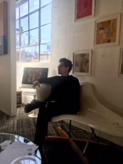
There is a quality about Stephen Cimini that is very lighthearted and joyful, and that belies the intricacy and deliberate symmetry of his work. He has had a history that I'm sure there is so much more to than is apparent, and yet somehow what may have been a life of struggle for someone else he has embraced for its energy. What led him to begin his current style of work is a love of architecture and the hidden spaces between buildings that was only visible for a short period of time when buildings in New York City were demolished prior to something new being built. He took photographs of some of the areas that he then later incorporated into the way he began to envision and draw onto the canvas, with the geometrical and symmetrical shapes and shadows left behind after demolition taking on their own beautiful life in his designs. Working as a professional artist in the fine art field and also having had extensive experience in the advertising and design worlds, his work is precise, measured and deeply profound in its colors and textures. But there is something more that can only be described as visionary that brings his work to another level.
When we met in his studio recently, we talked about the pieces he is working on now and he described how they had evolved as all of his work does, with one style growing over time into another and the lines and shapes having play and conversation and a thread that links them and builds one onto the next. For a time he began incorporating mosaics into his work, the intricacies of the patterns building off of the pieces he had created before, and now in his most recent work there seems to be a movement toward more angular lines instead of the softly flowing scrolls of the mosaics, and a simpler more contained use of the lines and the colors within them. In his artist talk he had spoken about his use of white space in his pieces, and spaces that were shaded in one color that created a feeling almost of relief for the other colors that were within a central area, a design technique that had grown out of his earliest pieces, and he spoke about that with me again in his studio as he shared the trajectory that organically has led from one visual style to another. As we talked and discussed his work an occasional smile or laugh would emerge, and we found ourselves reminiscing about New York City life in the 1980's and 90's, and what Jersey City had been like when he moved there. Throughout his studio were furnishings and functional pieces that had been covered with paint of different kinds and colors, and the overall experience of seeing the space left me with a feeling of vibrancy combined with a measured and thoughtful designer's vision. He had created a holder for his T-Squares because he uses so many that they were getting underfoot, and even that holder was beautiful. I have always loved T-Squares since I first used them in Junior High School geometry, but there was something more to the T-Squares in Stephen Cimini's studio that I had never encountered or understood in that way before. His work and the tools of his trade create form and symmetry out of the blank of a canvas, a vision that starts with the drawing of lines and is then fulfilled by the emergence of color and shades of color and shadow and texture, and as he works and the expression of his inner vision appears, there is a feeling of the origins of creation taking shape from the chaos, bringing form and beauty for the mind and heart to behold.
Stephen Cimini
In His Studio
Jersey City, New Jersey
The Early Stages Of A Painting
The First Symmetrical Lines
Beginning To Emerge
The First Painting That Began This Stage
Of His Creative Journey
A Work In Progress
A Designer's Vision For A T-Square Holder
That Is Functional And Beautiful
A Storage Piece That Looks Like A Work Of Art
Blessings,
Jannie Susan


No comments:
Post a Comment